
Preppy Pastels: Joyful ‘80s-Inspired Colours For 2022
by Carlisle Homes
Discover Wonder, Dulux’s fresh and energising palette for 2022.
Get ready to step back in time! The Dulux Wonder palette – one of three trending colour palettes in the Dulux Colour Forecast for 2022 – is a playful homage to the 1980s, with preppy pastels and summery tones, accompanied by bold stripes, checks and florals. And it’s the perfect look to lift our spirits after a challenging year; “These colours set the stage for regeneration and growth, with unexpected tones drawn from the natural world,” says Andrea Lucena-Orr, Dulux Colour and Communications Manager. “As we add more colour to our interiors, our imaginations are rekindled.”
Ready to bring a little nostalgia into your home? Here’s how.
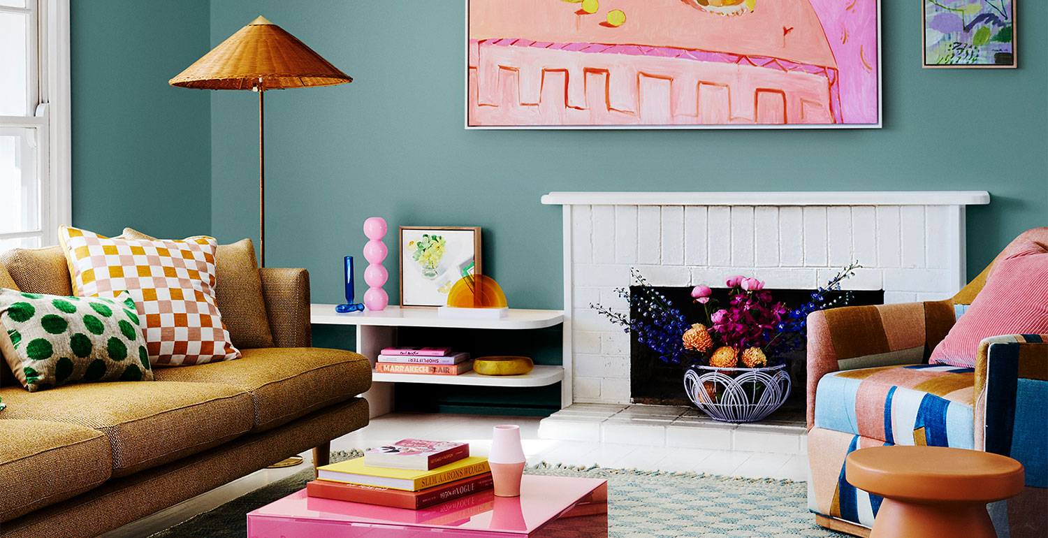
Unexpected combinations keep the Wonder look fresh and exciting; think quaint florals paired with sleek, contemporary furniture. Featured here: Amberley, Harpley Estate, Werribee.
Wonder palette: Fun & whimsy
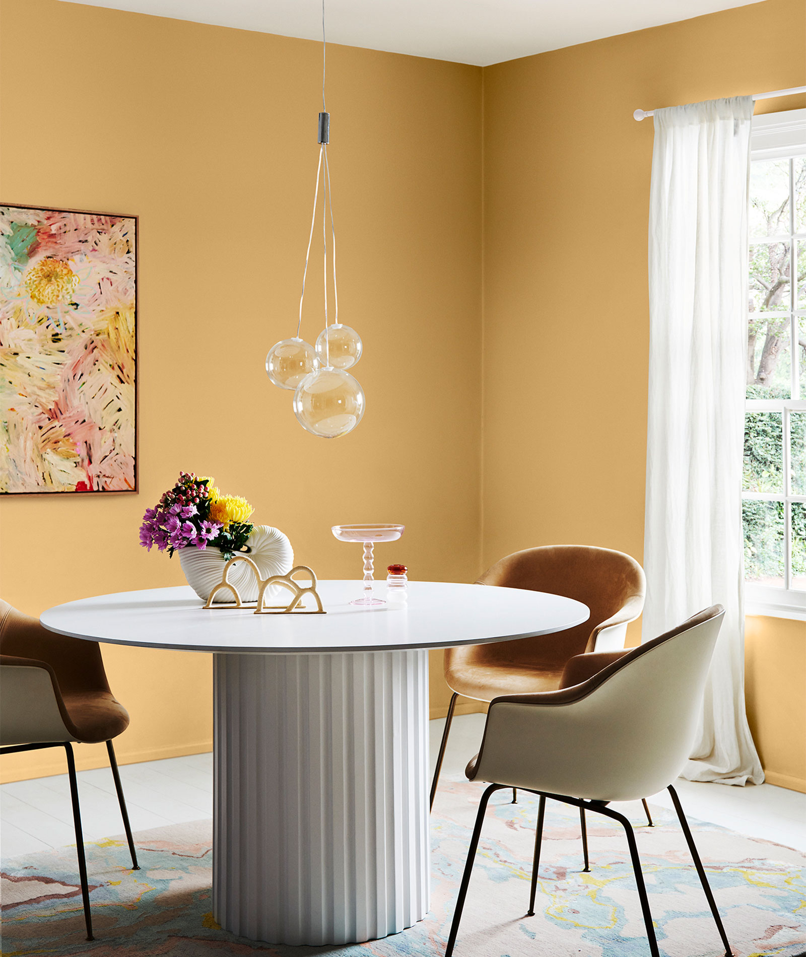
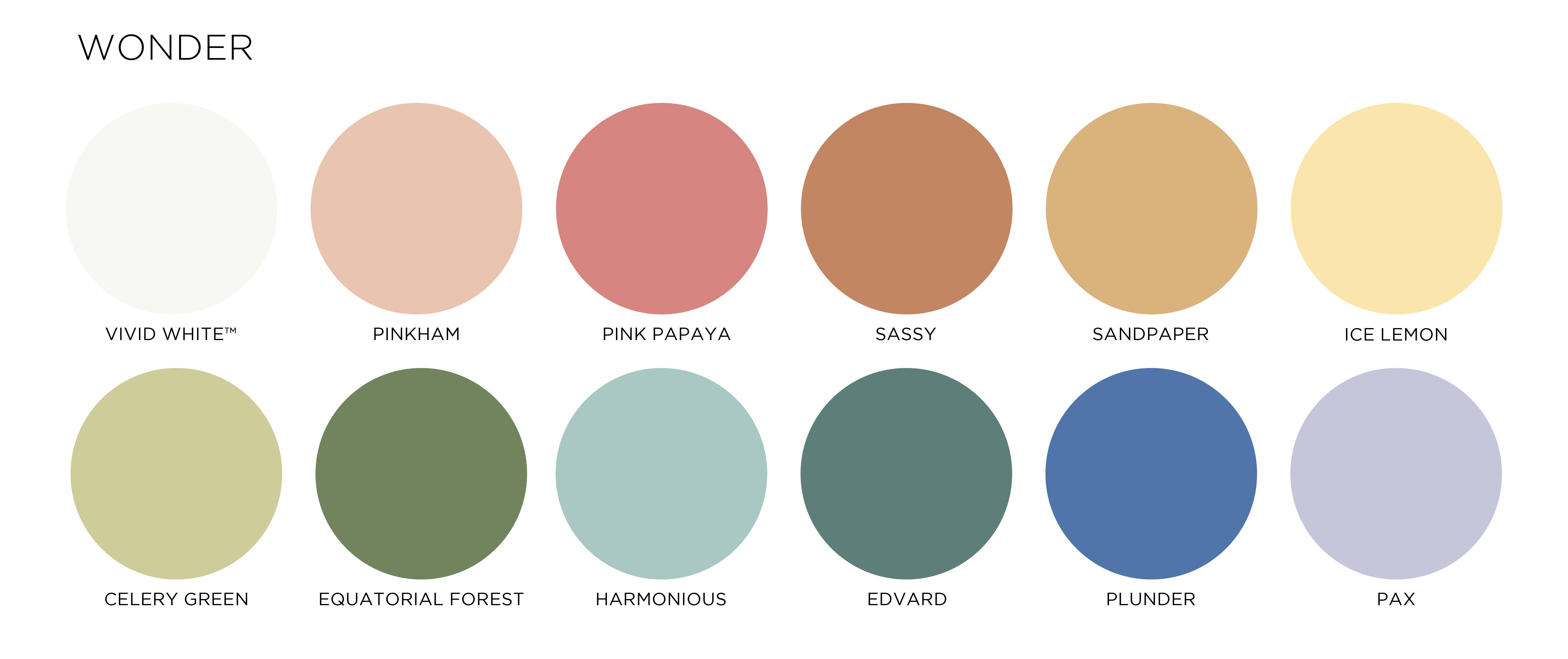
With its preppy pastels, such as lilac, lemon, soft pink and cornflower blue enlivened with touches of gold, the Wonder palette is not for the faint-hearted. But break away from your safe neutrals and introduce some playful colour – even in a small way – and you’ll re-energise your home and bring it right up to date.
With this trend, cheerful pastels are accompanied by bold patterns in upholstery and rugs, such as a chintz, houndstooth prints and checks. Unexpected combinations keep the look fresh and exciting; think quaint florals paired with sleek, contemporary furniture; needlepoint cushions and fluted glass; and woven rattan furniture set against a wall of candy pastel.
Break away from your safe neutrals and introduce some playful colour to re-energise your home. Image courtesy of Dulux®. Photographer: Lisa Cohen Stylist: Bree Leech. Artwork: "White Waratah" Original Artwork by Cat Maddy, Forman Art and Framing.
How to use the Wonder colours
So how can you apply this 80s-inspired look to your home without making it look like the set of Miami Vice? The trick is not to go overboard.
Consider painting the wall behind your bed a mint green and topping the bed with blowsy floral linens, and pairing these with contemporary, clean-lined timber side tables and glass pendant lights or lamps with touches of gold.
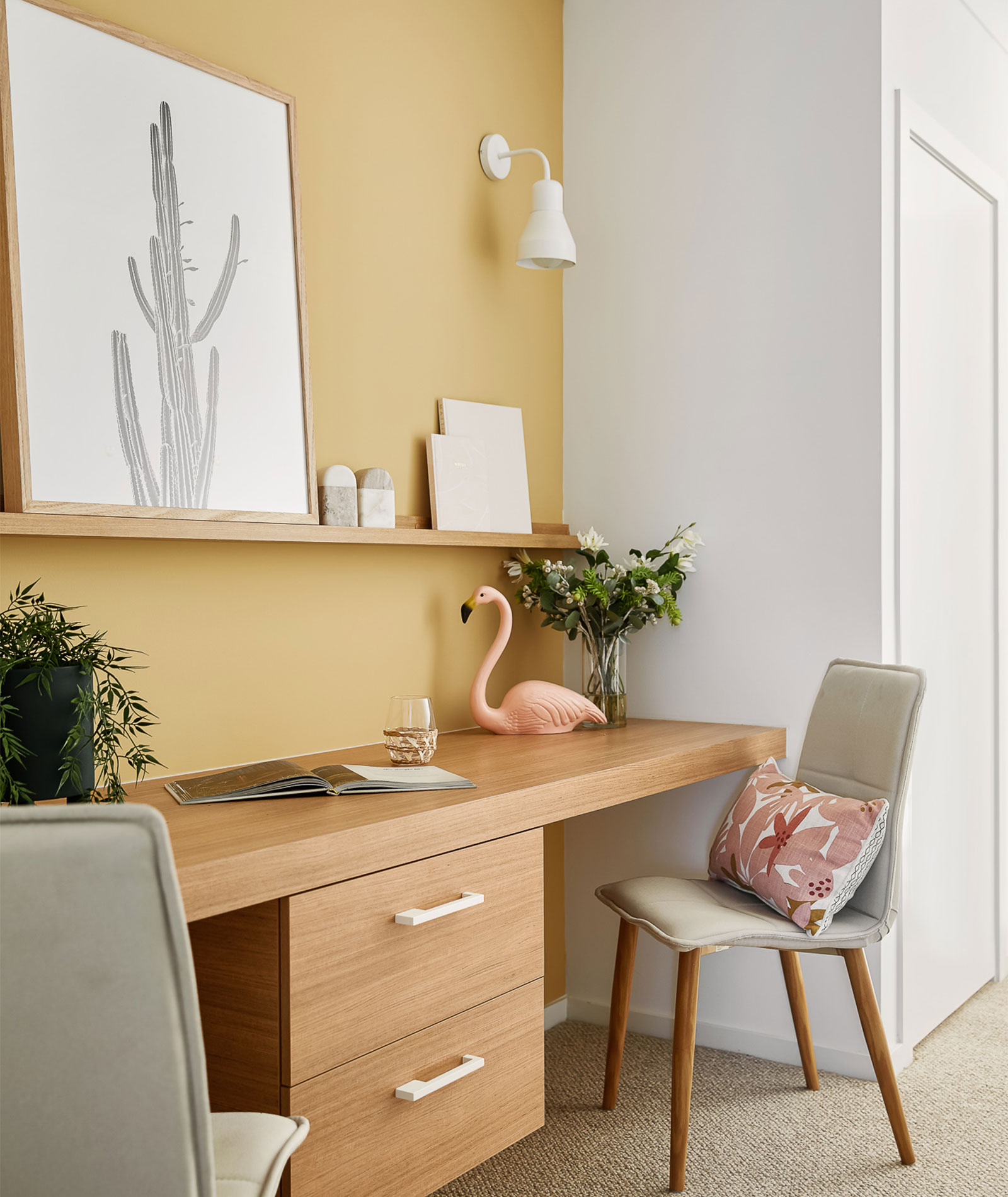
Apply a dusty pink or lilac paint, with touches of gold, to the wall of a study nook, and then opt for a minimalist wire desk chair and chunky floating shelves in warm oak.
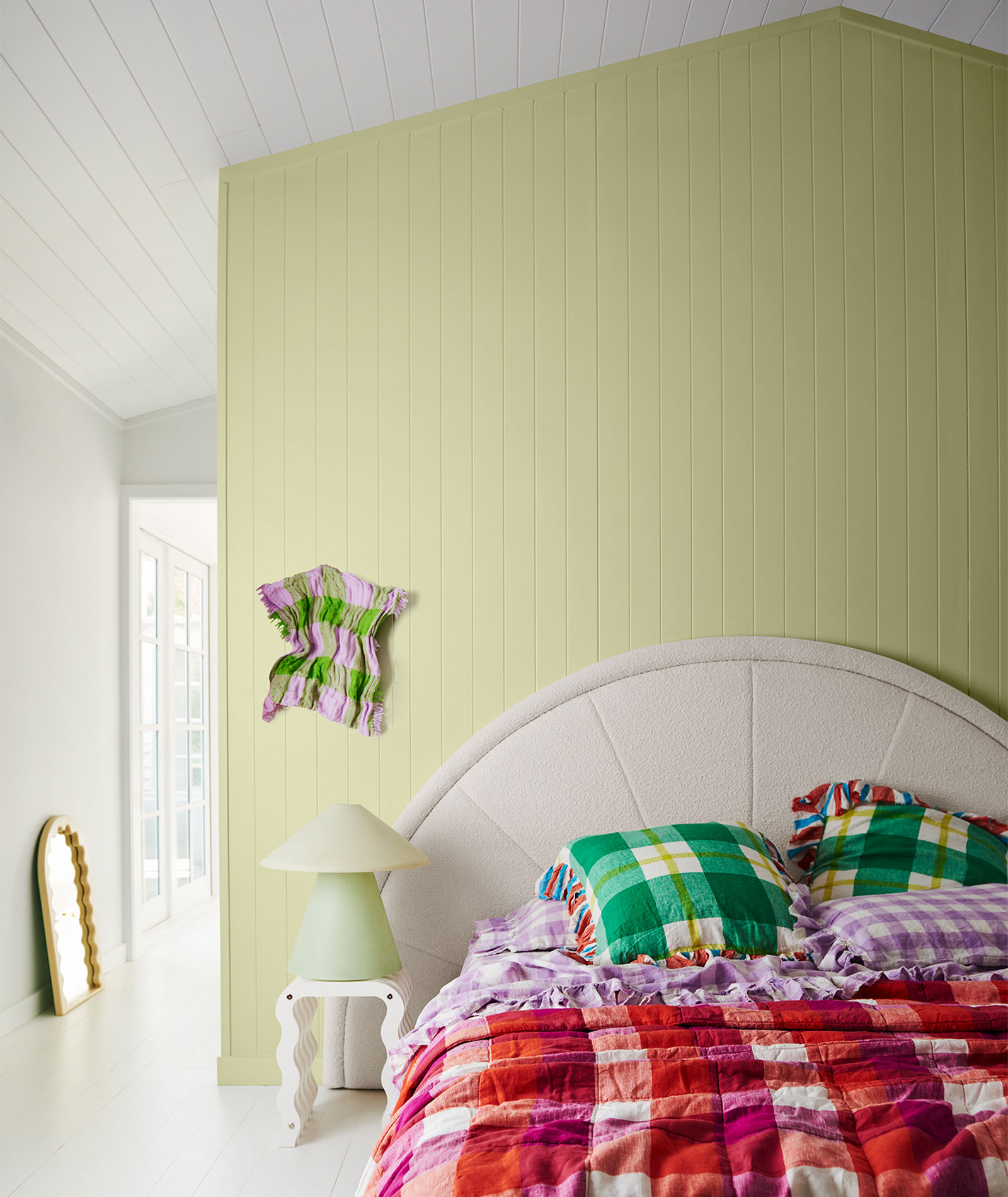
The Wonder palette brings minimal furniture to forefront and inspires pops of colour, like a pastel feature wall behind your bed. Image courtesy of Dulux®. Photographer: Lisa Cohen Stylist: Bree Leech
If you’re keen to experiment with bold, 80s-inspired prints, choose one and make it the focal point, while keeping the rest of the room simple. For example, lay a leopard print rug in the lounge or theatre room, with a creamy-toned, modular sofa and a boucle armchair in a soft pastel such as duck egg blue or lemon. Or upholster a single armchair in an eye-catching houndstooth print, and use tonal shades of one gentle pastel for the surrounding scheme, such as your walls and upholstery. Learn how to introduce the perfect pastel palette into your home here.
Where they work well
“For the workspace, look to fresh and energising tones, such as Dulux Harmonious (a duck egg blue) or Celery Green. And don’t forget your front door – there are some gorgeous hues to jazz up your entry, such as Dulux Edvard (blue green) or Pink Papaya,” says Lucena-Orr.
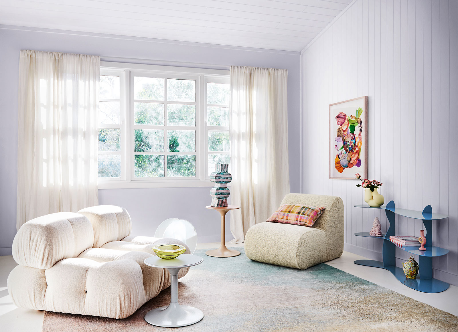
Image courtesy of Dulux®. Photographer: Lisa Cohen Stylist: Bree Leech. Artwork: "Empty Wishes" Original Artwork By Gabrielle Jones, Studio Gallery.
These poppy tones are also a clever way to brighten up a teen or tween’s bedroom without spending a fortune – all you’d need is a lick of wall or ceiling paint, some new bedlinen and a couple of art prints. Alternatively, use these tones to freshen up a family bathroom or to set a laid-back and welcoming vibe in your home’s entry.

Complement the Wonder palette in your home! Image courtesy of Dulux®. Photographer: Lisa Cohen Stylist: Bree Leech.
Eager to see how the latest colour trends work in a real home setting? Visit one of our Carlisle display homes conveniently located in multiple sites across Melbourne, where our interior designs have brought these trends to life. You can also explore Dulux’s Restore and Flourish palettes on our Home Files blog.