Zoning Spaces: Styling an Open Kitchen-Living-Dining Area
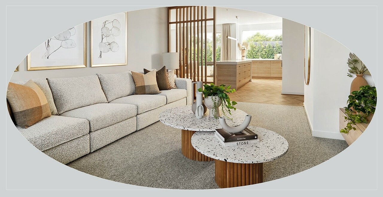
We break down expert styling tips to create defined zones in an open kitchen-living-dining area.
There’s much to love about an open kitchen-living-dining layout – it’s practical, inviting, entertaining-friendly, and makes great use of light and space. But with a large space like this, clever styling is required to prevent it from feeling cold and undefined. Look to create ‘rooms within a room’ – appealing individual spaces that each have a clear purpose, but also work together as a whole.
Sound tricky? Not at all – here, our expert interior designers reveal how to go about it.
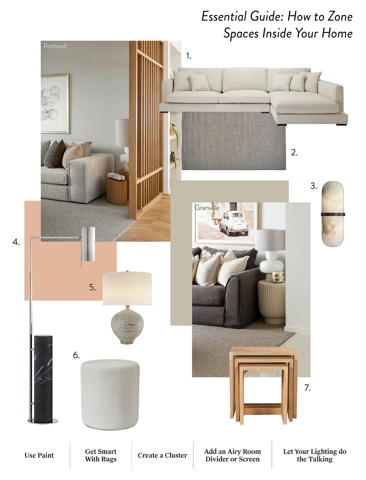
By planning out your dedicated zones, you will be able to plan out your space to suit your lifestyle needs.
Featured here: Rothwell, Aurora Estate, Wollert
1. Clovelly, James Lane. 2. Rug, Lowe's and RONA. 3. Melange Pill Form Sconce in Bronze with Alabaster, The Montauk Lighting Co. 4. Alma Floor Lamp in Polished Nickel and Black Marble, The Montauk Lighting Co. 5. Gaios Table Lamp in Pharaoh White, The Montauk Lighting Co. 6. WESLEY Linen Milk Ottoman, IVORY by Madras Link. 7. Tables, James Lane.
Plan it out
Start by thinking about the activities that need to take place in each space. Will you have weeknight meals at the kitchen island? Does the family like to stretch out to watch movies? Is the TV more important than the fireplace? Do you need a large coffee table for board games? Will your dining table double as a homework zone? Answering these questions will help you figure out how much room you need to allocate to each space and the style and size of furniture you’ll require.
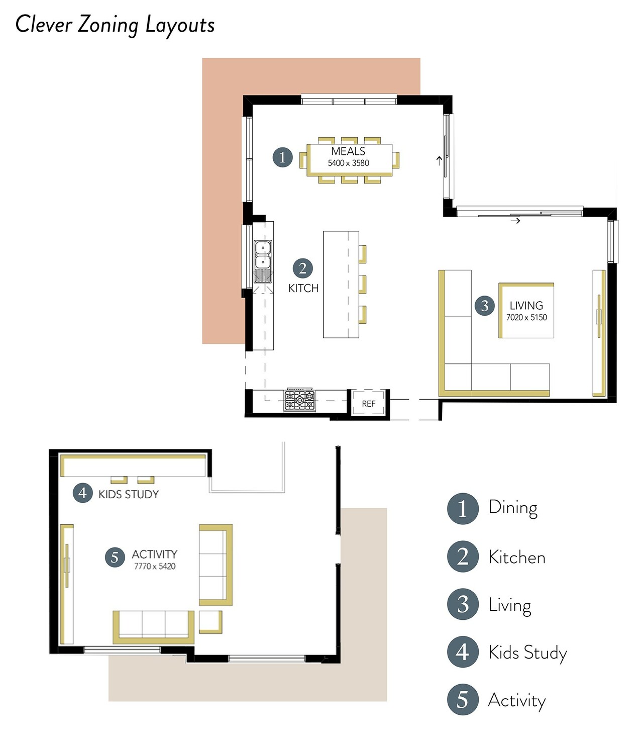
With clever zoning, you can create different spaces for activities in your open plan layout, giving you the freedom to set up your space!
Measure furniture before you buy it and use newspaper to map out how it will work once in the room. Ensure you leave enough space between large pieces like the sofa and dining table for people to move around comfortably.
Use paint
Paint is a quick, easy and affordable way to create definition in an open room. Use different tones of the same colour to define a living and dining area or colour-blocking a particular spot, such as a study zone.
Wallpaper works brilliantly too; add drama in a dining area with a wall of richly textured wallpaper, or line the fireplace wall with a bold, patterned paper to define the living area.
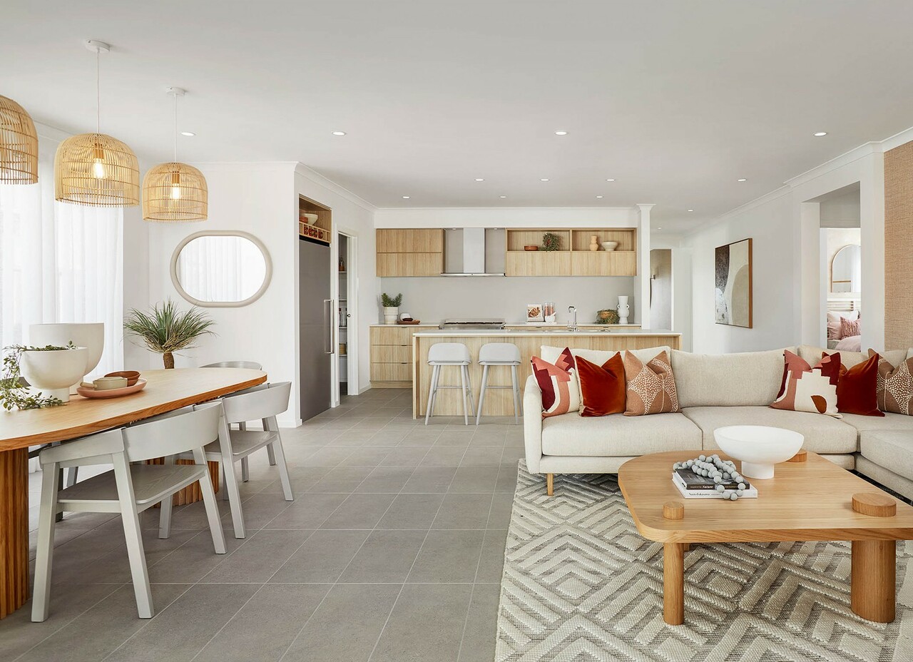
Choose a rug colour that is a shade or two darker than your walls and soft furnishings in a material such as art silk for a lush, layered effect. Featured here: Indigo, Orana Estate, Clyde North.
Get smart with rugs
Rugs are the perfect tools for creating a visual boundary within a larger space.
Define your living zone by adding a plush, generously sized rug under your sofa and coffee table. Pick a material such as jute or wool in a neutral tone for a low-key look or go bold with a pattern.
Not sure about size? Bigger is better when it comes to rugs. It should fit comfortably beneath the legs of your sofa and coffee table, with around 20 to 30cm space between the rug and the wall.
A fabulous rug can also be used to anchor a dining room within an open-plan space. Size-wise, look for a style that is around 60cm wider than your dining table so that chairs can be pulled out comfortably. Create a lush, layered effect by choosing a rug colour that’s a shade or two darker than your walls and soft furnishings in a material such as art silk for a sense of opulence.
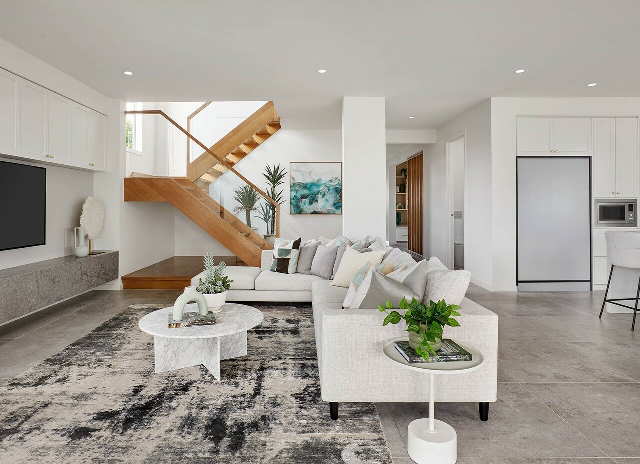
Group furniture into clusters to create cosiness! Choose the right sofa to separate your living zone from your kitchen and dining zones. Featured here: Sorrento Grand, Redstone Estate, Sunbury.
Create a cluster
One of the most common decorating blunders in an open room is to position furniture all around the edges, which makes it feel a little like a doctor’s surgery. To create cosiness, group furniture into clusters, such as an L-shaped sofa that sections off your living zone from the kitchen and dining zones, or a pair of armchairs with a side table by the window where you can chat or read a book.
Pick a focal point
Give each zone its own focal point – something that people will naturally gravitate towards. This could be a stunning artwork above the living room fireplace, a twinkling chandelier over the dining table, or a dramatic stone benchtop on your kitchen island.
Add an airy room divider or screen
You may not want solid walls and doors, but sometimes a bit of separation is a good thing. A semi-open timber screen is ideal; use it to visually carve out a theatre or dining area, without sacrificing light, ventilation or view-through.
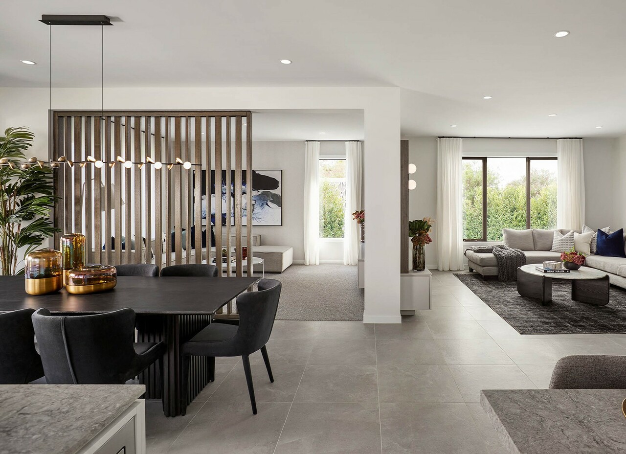
Select unique lighting, or opt for pendants to make each zone feel unique and special. Featured here: Canterbury Grand Deluxe, Aurora Estate, Wollert.
Let your lighting do the talking
Lighting is a great way to make each zone feel special. For an appealing, layered lighting scheme, light each area differently, whether that’s a pendant over the dining table, downlights in the kitchen or a combination of wall sconces and floor lamps in the lounge.
Design a study nook in a bedroom or playroom
A living space isn’t the only part of your home that can do double duty – if you’ve got the space, bedrooms and playrooms make ideal spots to squeeze in a kids’ study station.
Built-in study nooks make better use of space than freestanding desks and are a feature that future buyers will love. Run a built-in desk along one wall of a bedroom or playroom, with a mix of open display shelves and a few cupboards to keep books and folders organised and out of sight.
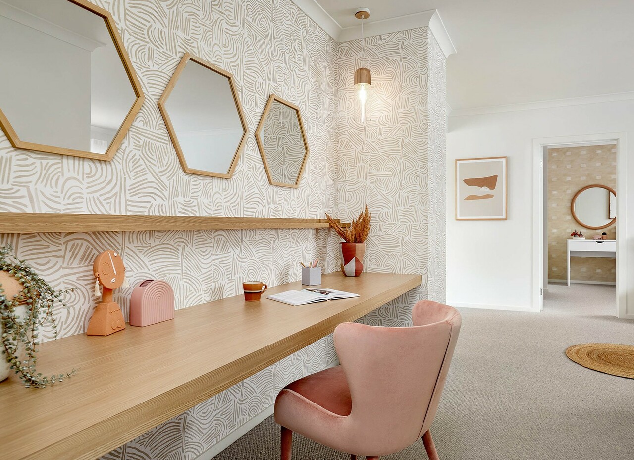
Make a feature study nook! Experiment with wallpaper, decor, chairs and colour to liven up the space. Featured here: Piermont, Attwell Estate, Deanside.
Make a feature of your study nook by lining the back wall with funky, patterned wallpaper. Or, if you prefer to keep it hidden away when not in use, create a ‘cloffice’ (an office in a cupboard) that tucks away behind sliding doors or bi-folds, or use a decorative folding screen.
Visit one of our many Carlisle display homes across Melbourne to pick up loads of great ideas for decorating your open-plan living space.
