Display a Confident, Colourful Statement with the Dulux Comeback Trend
by Carlisle Homes
Source: Dulux, Photographer: Lisa Cohen, Stylist: Bree Leech
The second key trend in Dulux Colour Forecast 2020, Comeback celebrates bold colours, with a mix of contemporary and vintage design references.
The trends captured in Dulux Colour Forecast 2020 are a fantastic source of interior design inspiration. And if you find yourself drawn to bolder colours and an eclectic range of vintage and contemporary design pieces, then the second trend in the forecast, Comeback, could be the one for you! Here, we ask Dulux Colour and Communications Manager Andrea Lucena-Orr to explain how you can bring it into your own home.
In contrast to the calming simplicity of the Grounded trend, which we featured in our previous story, Comeback combines saturated colours and rich textures to create unique and distinctive home interiors. “More than anything, it’s about confidence and individuality,” says Lucena-Orr. “It's about creating intimate spaces that tell the story of who we are and what fuels our passion.”
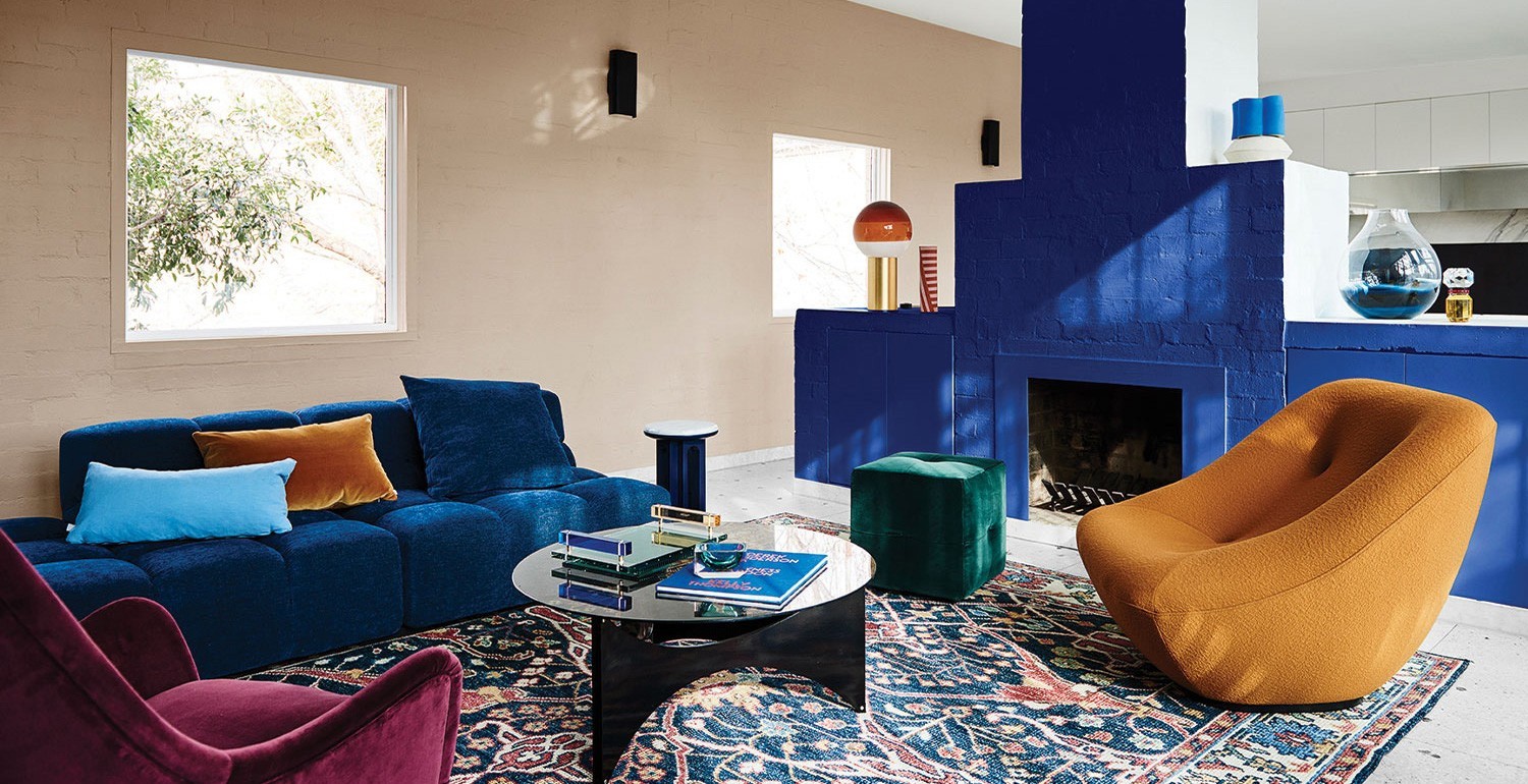
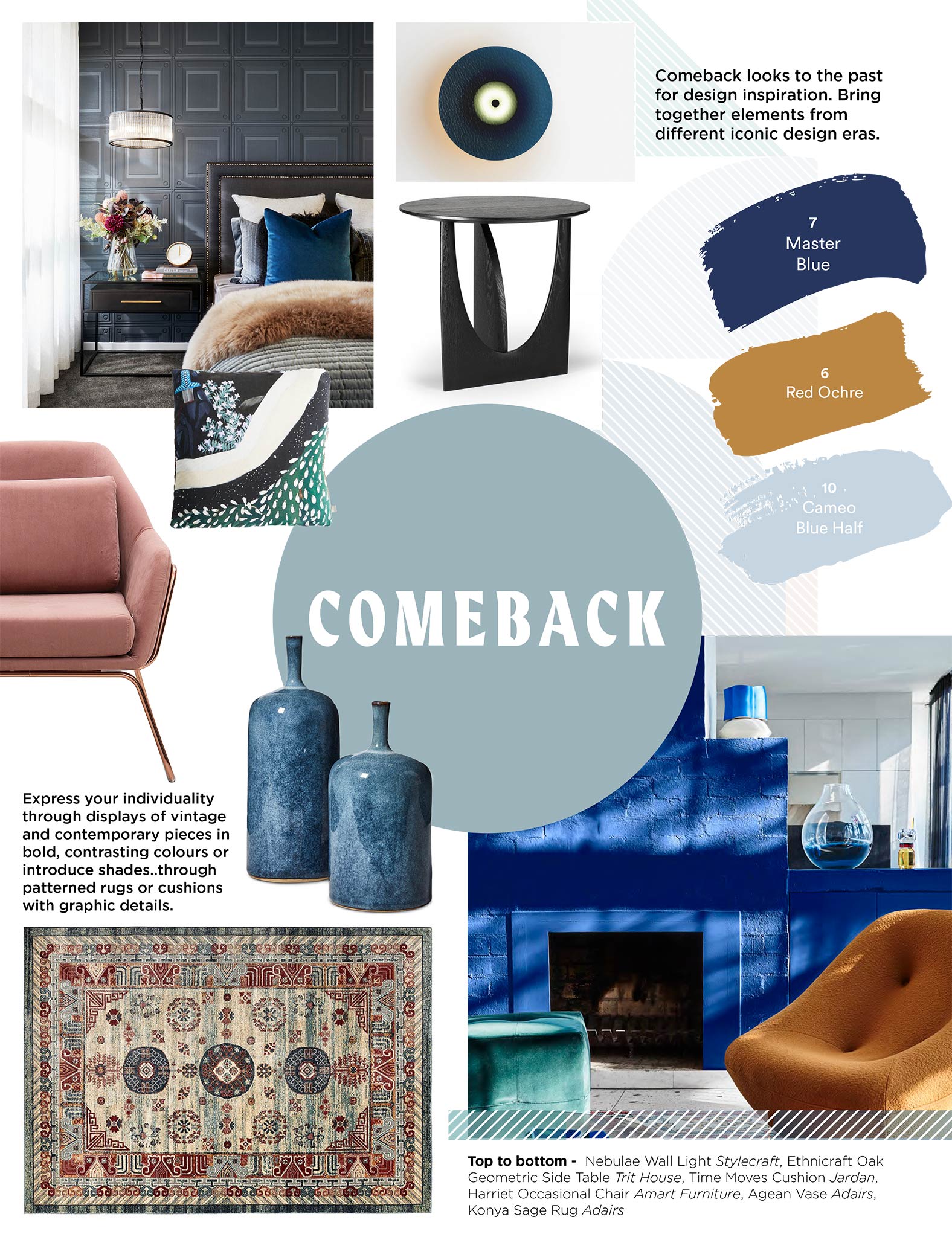
A hallmark of the Comeback trend, as its name suggests, is the way it brings together elements from different iconic design eras. “Comeback looks to the past for design inspiration,” says Lucena-Orr, “but it mixes the different influences.” For example, you might see an elegant mid-century armchair teamed with plush velvet ottomans and an Art Deco mirror, or a modern designer coffee table on a traditional Persian rug. The aim is to create a look and feel that’s contemporary, but with a healthy dose of vintage style.
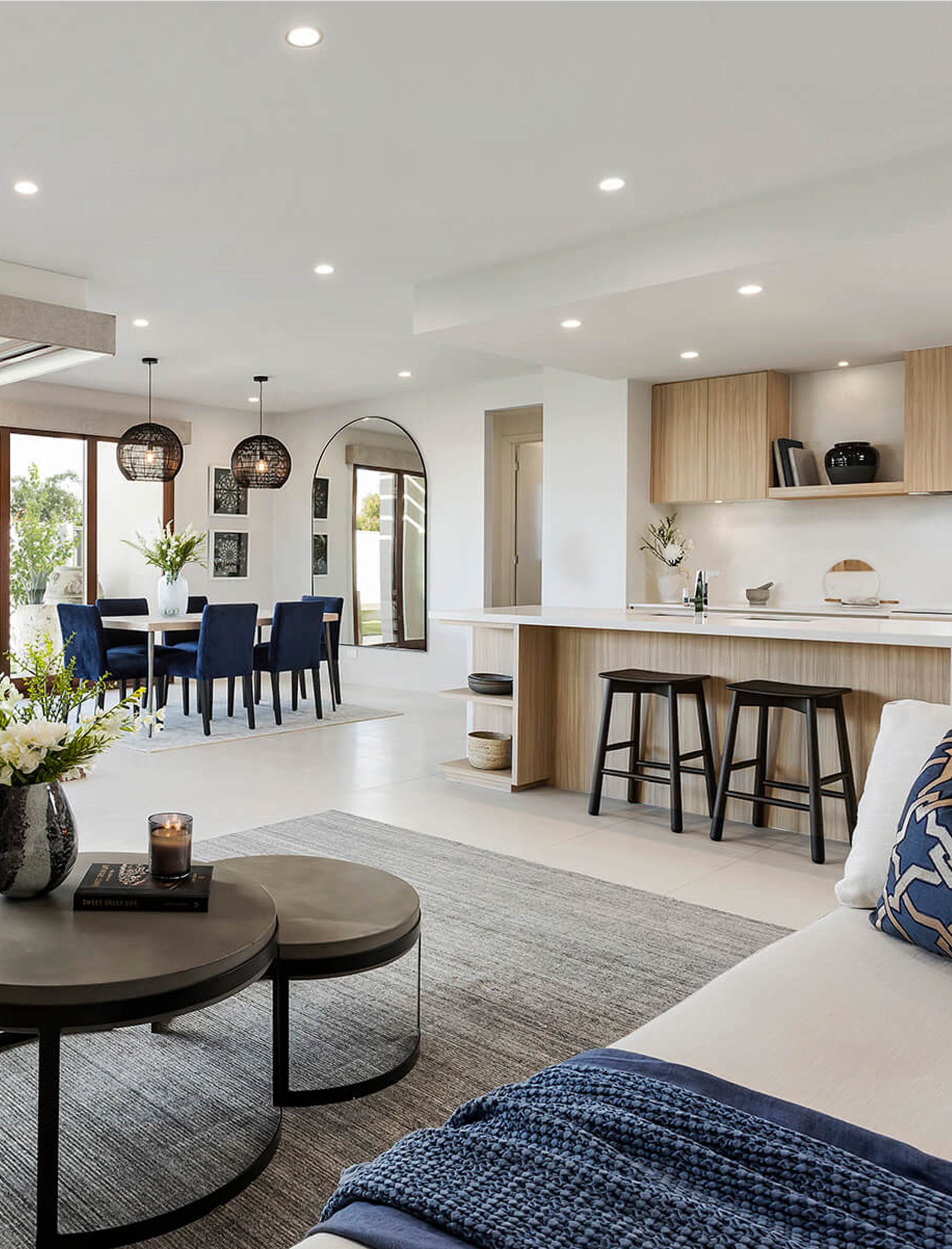
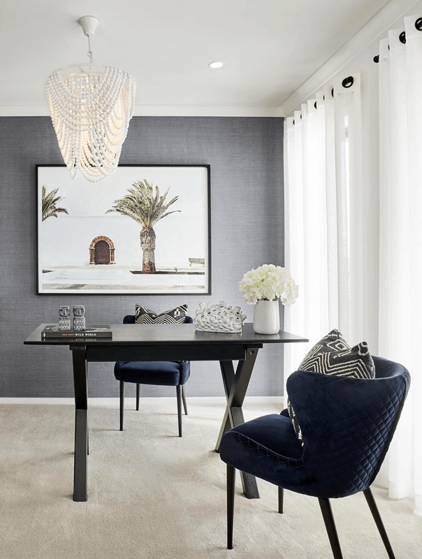
Langholm features at Newhaven Estate, Tarneit
Start with a beautiful blue
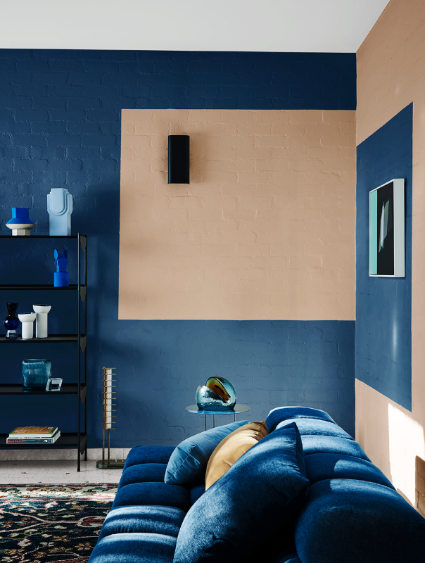
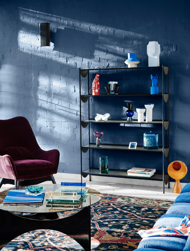
Blue will be popular across all interior design in the coming year, and it’s the most important hue in the Comeback palette. “A lot of the blues at recent design fairs have been inspired by bold, rich Yves Klein blue,” says Lucena-Orr, “but we’re also seeing traditional blues, such as Classic Blue, which is the Pantone Colour of the Year for 2020.” She describes Dulux Master Blue as having a “similar vibe” to Pantone’s Classic Blue and suggests using it to highlight features in a room, such as a fireplace or a column, or introducing it in a kid’s bedroom. Similar hues will be prominent amongst department stores and homewares retailers, so the opportunities to introduce them into your home will be endless.
“The beauty of vibrant blues is that they’re ‘look at me’ colours that will be the focal point in a space. As such, bolder colours like Master Blue and Undersea work very well as accents to neutral whites,” she explains. “But there are also lighter shades of blue like Dulux Blue Shell and Cameo Blue Half, which are serene, recessive colours and can make a room look bigger.”
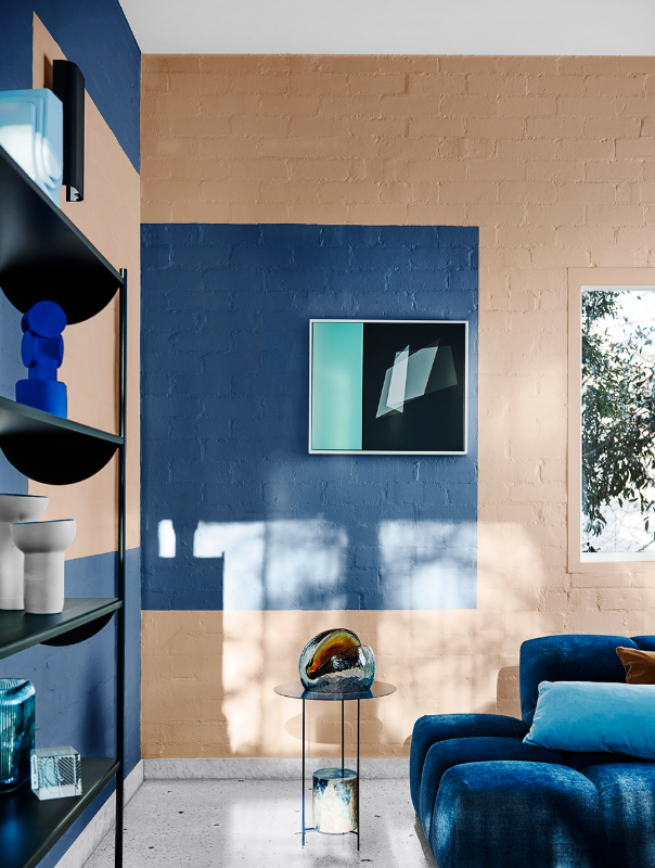
Artwork Featured: I Don’t Want to Push it’ original artwork by Liam Snootle, Studio Gallery Melbourne
Express yourself with bold accent colours
When used in tonal combinations, these different blues provide the perfect background for accent colours that reinforce what Lucena-Orr describes as the “vintage story” at the heart of the Comeback trend. This can involve simply painting blocks of contrasting colours onto your walls – for example, rich blue Carter’s Scroll against warm neutral Coffee Clay – or introducing vibrantly coloured objects and furniture that reflect your personal style. The essential eclecticism of Comeback provides a broad palette of colours to work from, and gives you the freedom to put your own stamp on your home’s interior, no matter what design era you prefer.
“Express your individuality through displays of vintage and contemporary pieces in bold, contrasting colours or introduce shades of ochre and plum through patterned rugs or cushions with graphic details,” suggests Lucena-Orr. “We’re still seeing leather in natural colours, like brown, taupe, toffee and caramel, but bold colours, such as bright blue, deep green and ruby red are being introduced in soft upholstery like velvet and chenille.”
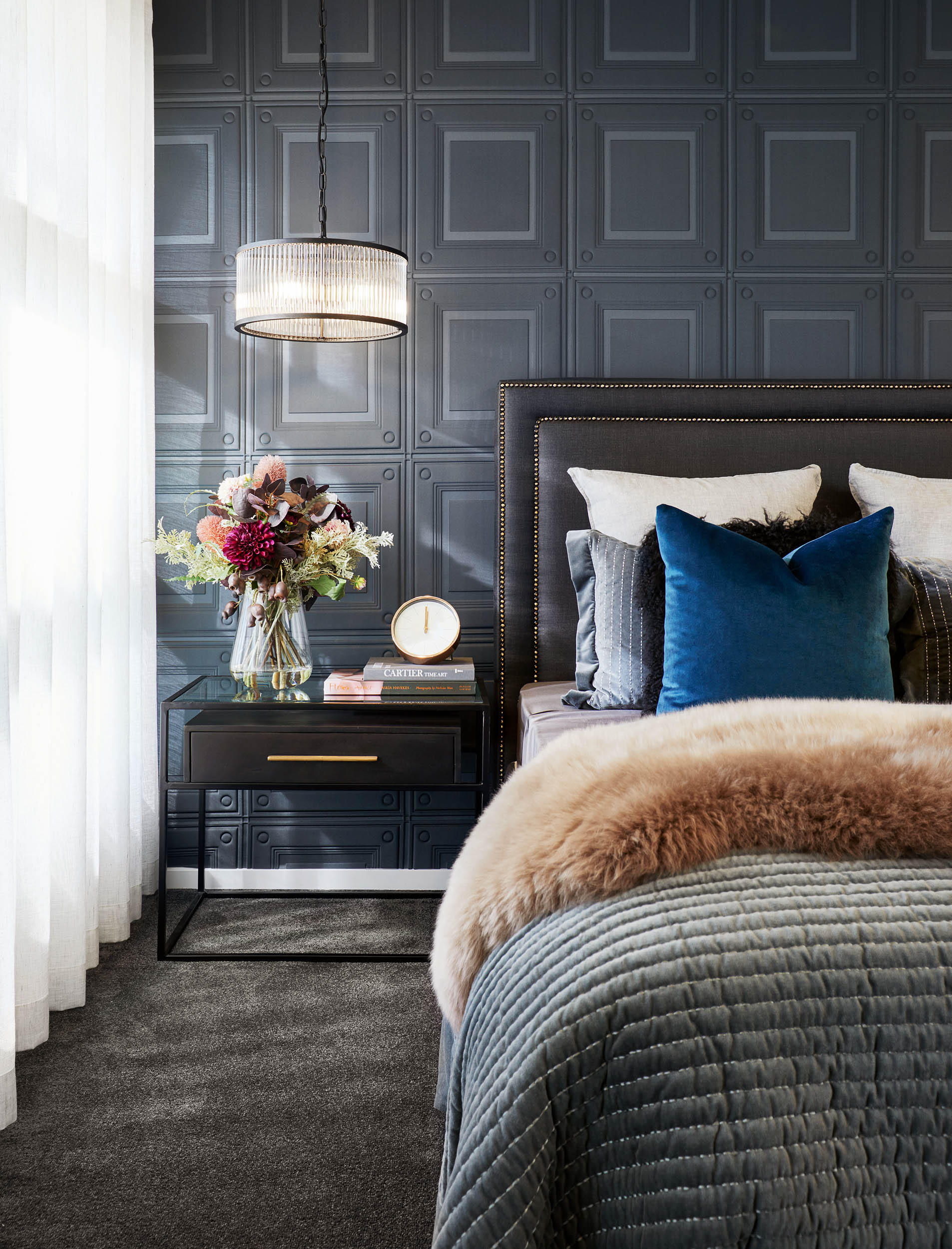
Piermont on display at Kaduna Park Estate
Find your own personal sweet spot
If you like the idea of Comeback, but worry that the overall effect will be a little too bold for your taste, the good news is that the trend can easily be adapted to match your personal preferences. Consider starting small, by introducing pieces of furniture or adding a feature paint colour. Experiment with different combinations of display objects and family heirlooms. And keep going until you find your sweet spot. You could even choose somewhere less prominent to begin playing with the themes from Comeback, such as bedrooms or bathrooms, before making changes to living areas.
You just have to remember that this kind of “maximalist” interior should never feel messy or overwhelming. As Lucena-Orr points out, “the best way to create balance is to unify your decor through a common colour palette.” And that’s why the tonal blues that underpin the Comeback trend are so important, because they can work beautifully in every room of your home, creating a sense of consistency and order.