
Colour is Back! Create a Joyful Home With New-Season Brights
by Carlisle Homes
Up the fun factor at home with the cheery and eclectic brights in Dulux’s new Reset palette.
With most of us spending more time indoors than ever before, creating a home that’s happy and uplifting has never been more important. Enter the colour experts at Dulux, who have come up with Reset – an energising palette of muted brights such as coral, blue-green and terracotta. It’s a little bit retro, a whole lot of fun, and it’s guaranteed to bring a smile to your face.
“As we retreat indoors, fond memories of past adventures and discoveries inspire our home spaces,” says Andrea Lucena-Orr, Dulux’s Colour and Communications Manager. “Life may be slower, but there’s joy to be had in a less frantic pace as we draw closer to family and our local community. Rich, brighter hues such as coral and stormy blue awaken our senses and allow for moments of optimism.”
The Reset palette is an eclectic mix of old and new, vibrant bold tones and retro colour combinations, which mesh together to create a happy and energising space. Image courtesy of Dulux® featuring ‘Women’s Business II’ artwork by Natalie Jade and ‘Morning Pool’ artwork by Charlotte Taylor via Greenhouse Interiors. Photographer: Armelle Habib. Stylist: Julia Green.
Reset is one of three palettes in the Dulux Colour Forecast 2021, which identifies the colours expected to dominate interiors in the year ahead. In the third of our three-part series on the forecast, we dip into the Reset palette and reveal how and where you can use these gorgeous hues in your own home.
And don’t miss our stories on the other two Dulux palettes – Nourish and Retreat.
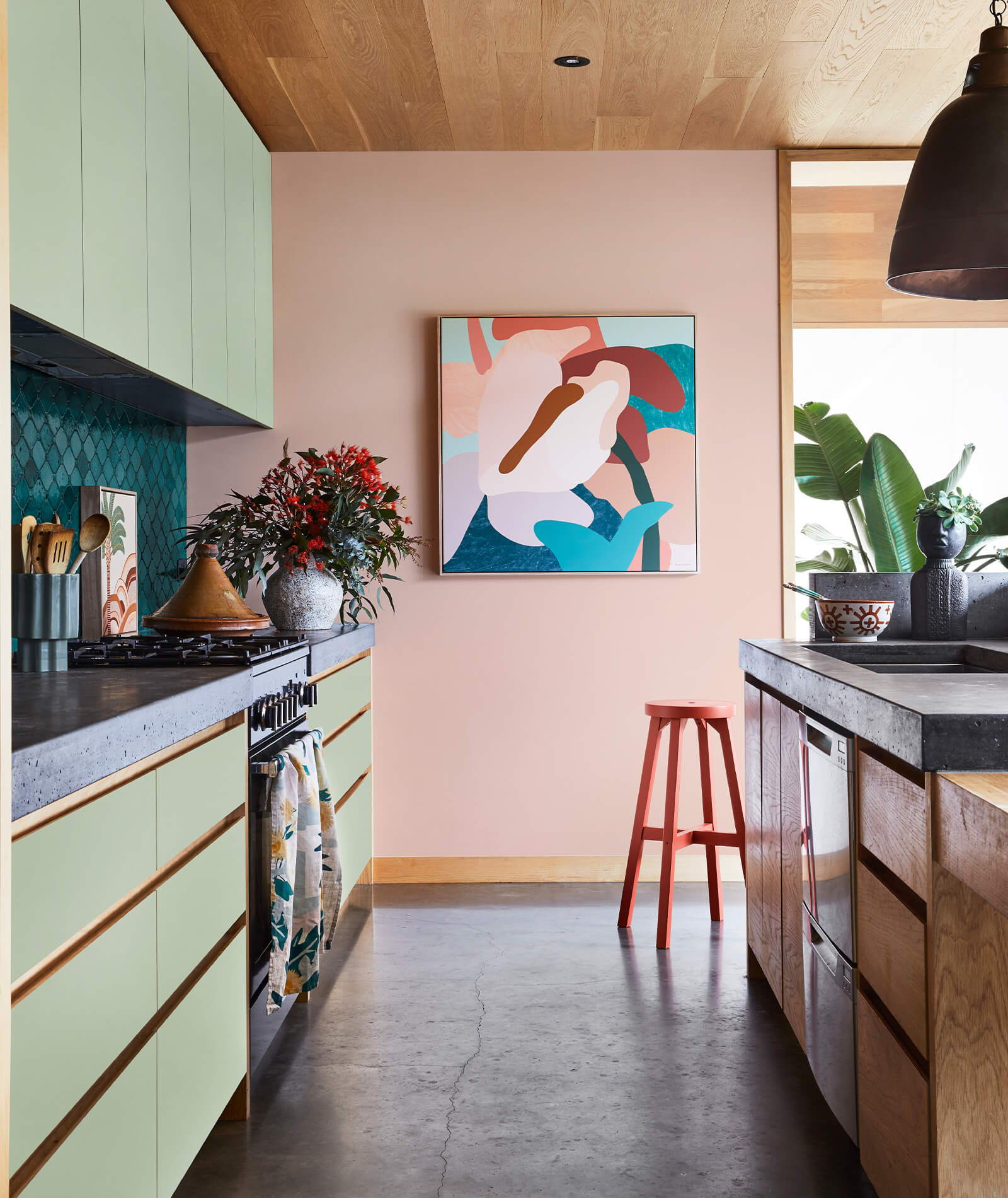
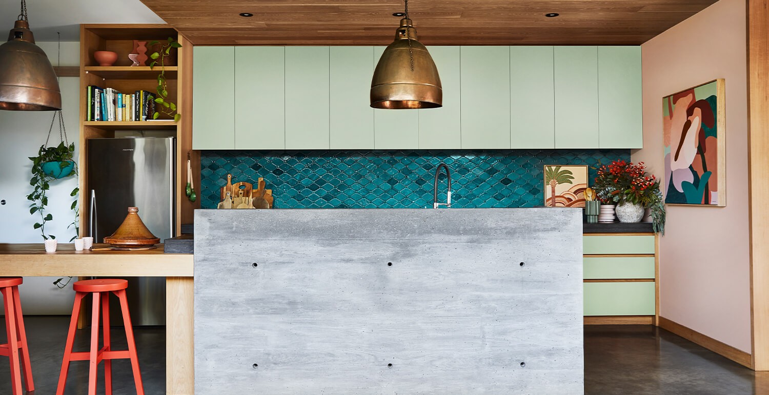
Embrace the bold and uplifting Reset palette in your family kitchen through muted tones for joinery and pops of playful colour in accessories. Image courtesy of Dulux® featuring ‘Anthurium II’ artwork by Kimmy Hogan and artwork on the counter by Karina Jambrak via Greenhouse Interiors. Photographer: Armelle Habib. Stylist: Julia Green.
Add colour to your kitchen
Unexpected colour combinations, such as sage, chilli and coral, are just the thing to add fun and flair to your kitchen, and make for a particularly forgiving palette in a busy family home.
Opt for the palette’s more muted tones, such as soft green or grey-mauve, for fixed features such as joinery and tiling – this way you can easily update the look of your kitchen down the track without having to alter the major elements.
Then add in pops of brights with bold, framed prints, funky wooden bar stools and painted walls, all of which can be replaced or updated when you’re ready for a change without much hassle or expense.
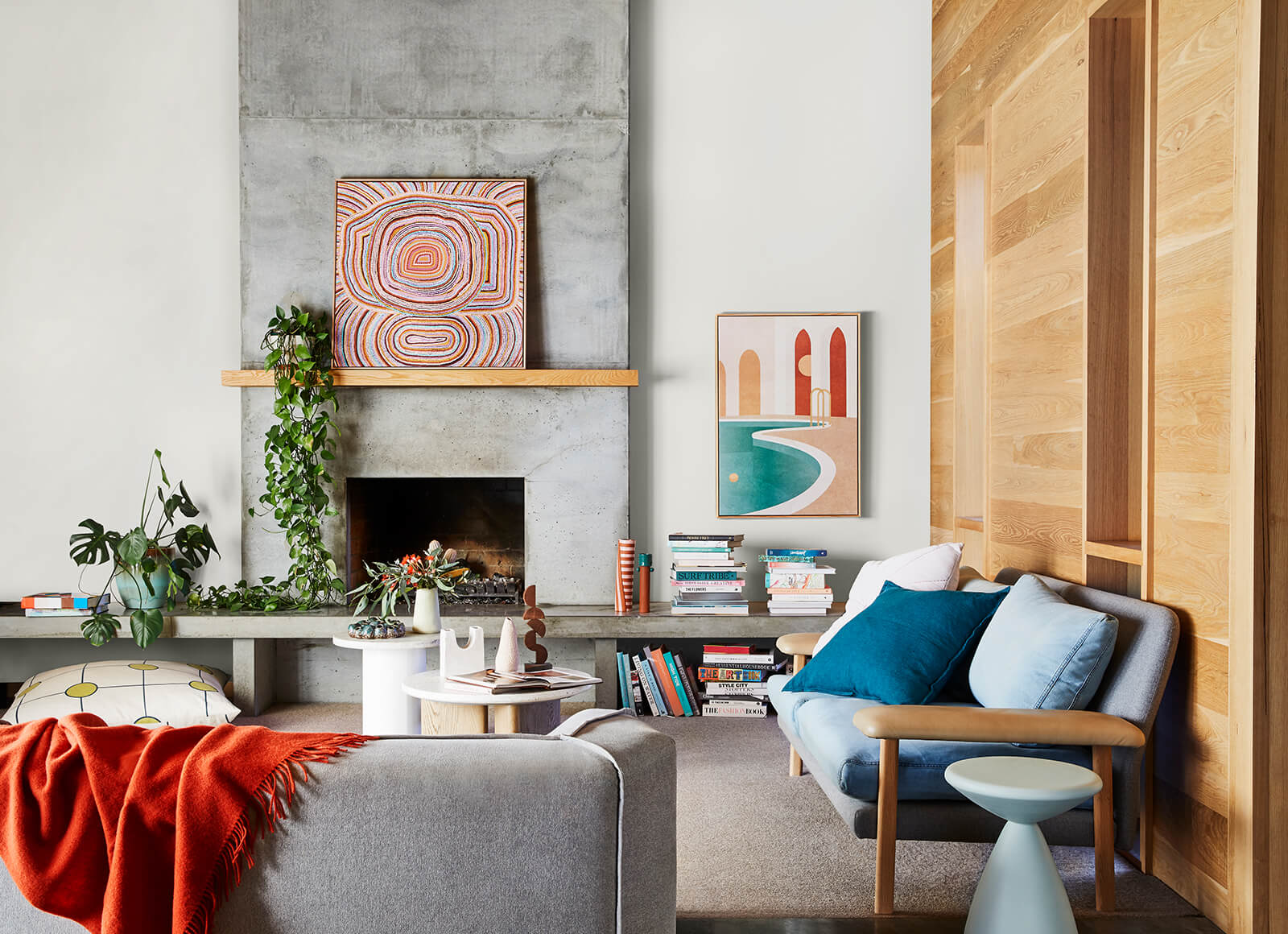
Incorporate a sense of renewal to your family room with the coral toned influences of the Reset palette through your soft furnishings and accessories, as pictured in Piermont.
Warm up a family room
Cosy up your living or family room and create a welcoming space for everyone to gather and create memories by adding in elements of the Reset palette. Start with a neutral palette of pale-grey flooring and sofa upholstery and introduce warm notes of coral, clay and deep blue-green in soft throws, scatter cushions and ceramics in a medley of different shapes and sizes.
The look is casual, uplifting and very much grounded in nature – mix different textures, old and new, and finish off the look with lush indoor plants and a few moments of personalisation, such as mementoes from your travels or framed family photos.
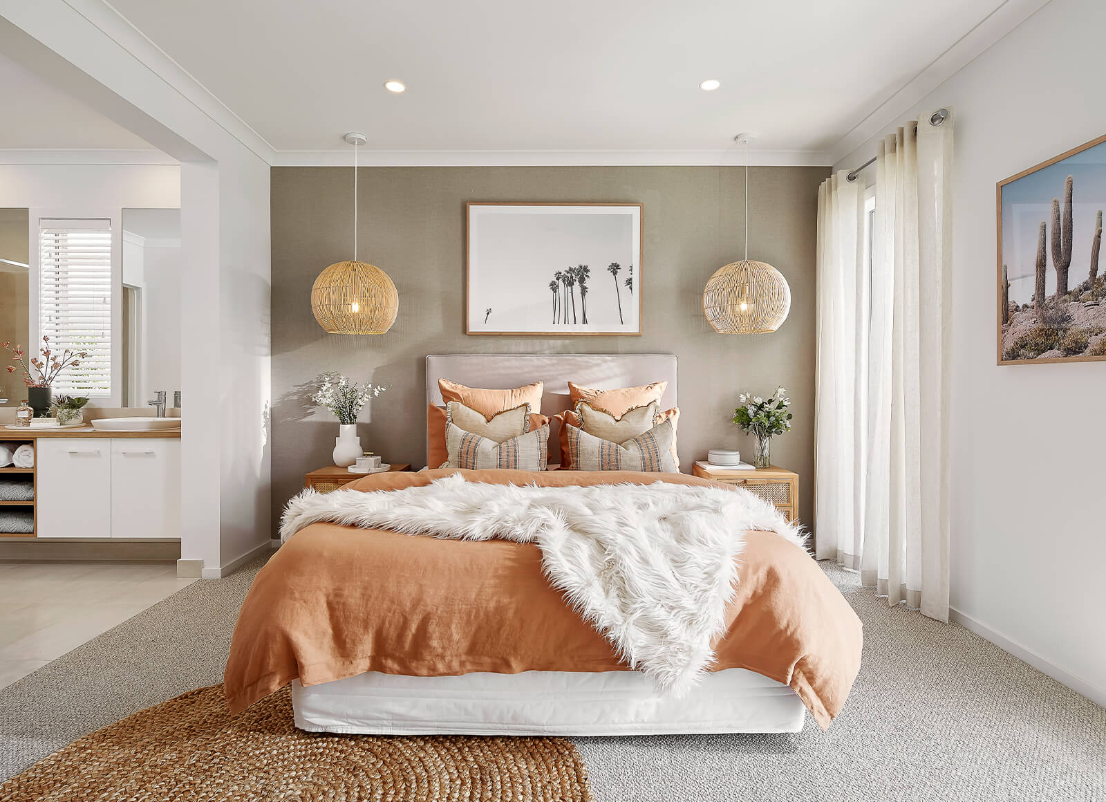
Enliven your bedroom by mixing hues of the Reset palette with your existing furniture for a refreshing yet unified aesthetic, as pictured in Amberley.
Brighten a bedroom
You’re guaranteed to wake up in a great mood when you’re surrounded by the joyful colours of the Reset palette. It’s also a great palette for those who are more comfortable with white or neutral walls and prefer to bring in colour through fabrics and decor items.
Start with a backdrop of warm white walls (try Dulux Natural White) and introduce cheery tones of a burnt orange and mustard in bedding, cushions and artwork. Seek out botanical prints or patterns with a coastal vibe to tie in with the palette’s natural feel.
Every room benefits from having a focal point and the bedroom is no exception. A small, carefully considered touch is all you need; try hanging a simple but shapely pendant light over the bedside table or add in an upholstered bedhead with curvy lines that stands out against the pale wall behind it.
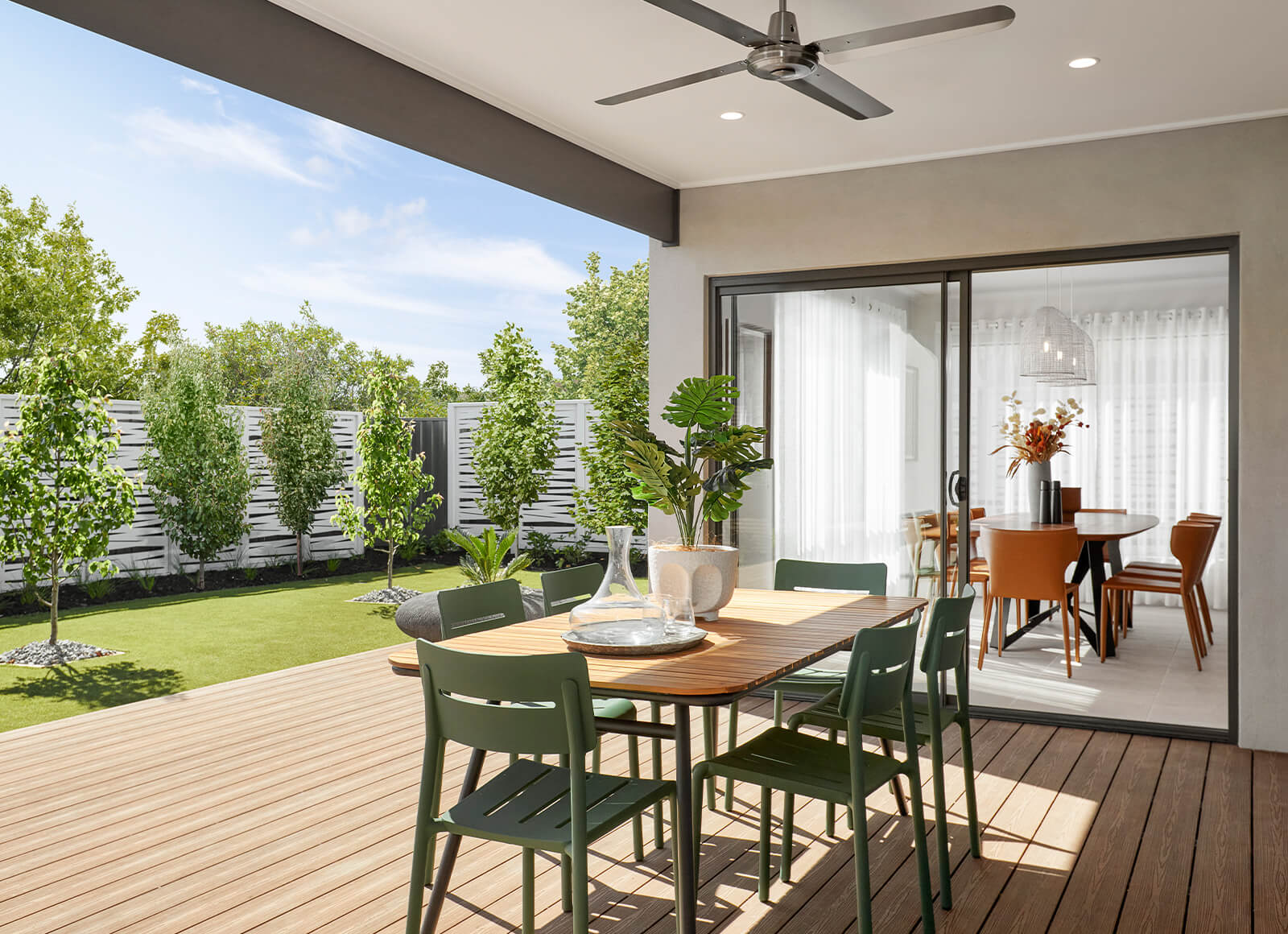
Blur the lines of where your interior meets your exterior with the help of botanicals, timber materials and eclectic furniture in uplifting hues of blue-green and energetic corals, as pictured in Cottesloe.
Energise your outdoor room
Take an alfresco area from drab to fab with accents of dusty rose, sea blue and rust in outdoor sofa cushions and accessories. Create an eye-catching plant cluster by painting them in new-season hues, add in a brightly coloured side table where you can pop a cold drink when you’re relaxing or lay a patterned rug underfoot (which has the added benefit of making your outdoor space feel like a proper room).
“Surrounding colour can be a remedy for the soul in challenging times,” says Lucena-Orr. “Use bright hues to incite energy and inspire a positive outlook. And remember, there are no hard and fast rules rule about what you should use where – just follow your instincts!”
Ready for a change? See how interior designers are using 2021’s hottest hues in different rooms of the home at our 23 display locations across Melbourne. Or view them from the comfort of your sofa with a virtual tour here.